Our team’s graphical artist had designed a concept art for our player avatar. From a graphical point of view, there was nothing wrong with it. However, I felt that it didn’t portay the aesthetic view of our game.
We wanted the player to feel like they were quite small and vulnerable when facing against the last boss. And the design didn’t quite portray that.
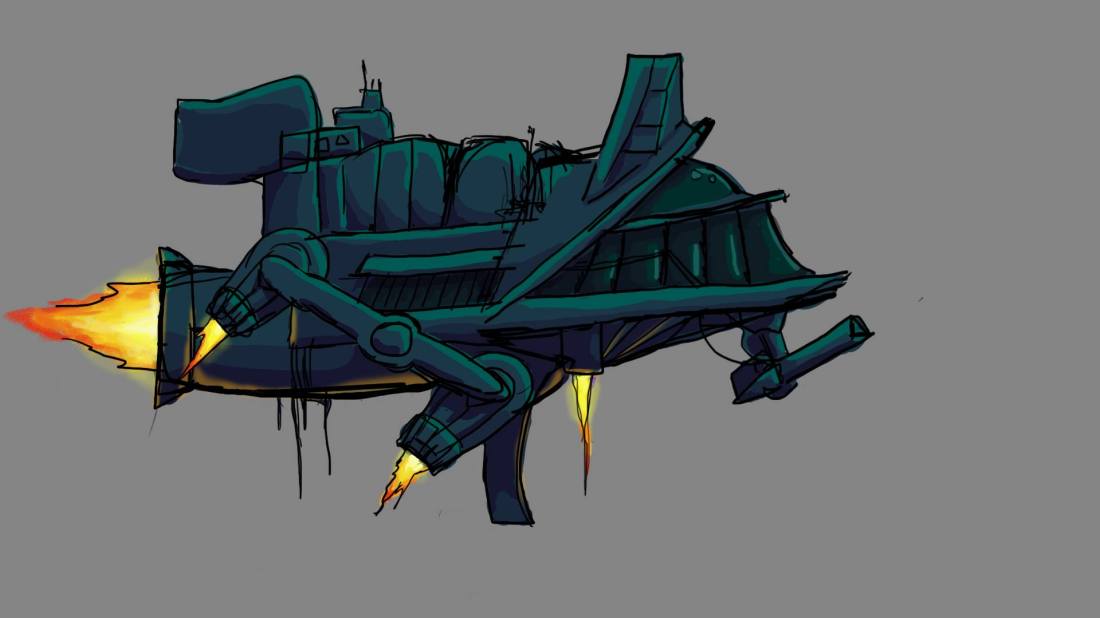
This was the first concept our artist came up with. I felt like it was too bulky and would make the player feel like nothing could hurt him, so I decided to give instructions to our artist on how to change it.
I told him that I wanted the ship to look weak and small. That it would feel more vulnerable, so that when you face against the boss, you feel a bit overwhelmed but in the end when you triumph the victory feels much greater.
After the feedback, this is what he came up with.
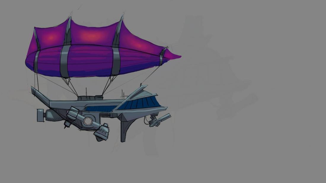
He kept the initial design of the ship which I told him was completely fine to do, since the design itself wasn’t faulty. What he did was to remove huge chunks of it that protected it, leaving it more open to damage, at least that is what it looks like to the player.
After this change, everyone in the team felt it represented the feeling we wanted it to give.
I felt that this was a major design decision since the player will be on screen for 100% of the time. If something you are controlling and looking at during the majority of the time you’re playing the game doesn’t give off the right feeling.
The game itself will feel a bit off. That’s why I decided to tell the artist if he could change the look of the avatar. After the artist remade the ship he even told us that it made much more sense than the earlier concept which made him understand our view of the game a bit more as well.
So, not only was this a major design decision, it also helped our team members to realize eachother’s view of the game as well.
